Kerala Help line numbers

അത്യാവശ്യം വരുന്ന നമ്പറുകൾ കുറിച്ചെടുത്ത് മൊബൈൽ ഫോണിൽ സൂക്ഷിച്ചാൽ നല്ലതായിരിക്കും. യാത്രകളിൽ, പ്രത്യേകിച്ച് ആദ്യമായി ഒരു സ്ഥലത്തേക്ക് പോകുമ്പോൾ ഇതൊക്കെ അത്യാവശ്യം തന്നെയാണ്.

Nearest Police station 100
Police   Helpline 0471-324 3000/4000/5000
Police High Way Help Line 9846 100 100
Fire Station 101
Ambulance 108
Crime Stopper 1090
Women Helpline 1091
Child Line 1098
Trivandrum Medical College www.tmc.kerala.gov.in
MCH Casualty : (24 hrs) 0471-2528300
Consumer Toll Free Helpline 18004251550
Food Adulteration Helpline 1800 425 1125 (Toll free)
Anti-Ragging Helpline 1800 180 5522(Toll free)
Online Enquiry: www.antiragging.in
Highway Alert 9846 100 100
Rail Alert 9846 200 100
SMS Centre 9497 900 000
K.S.R.T.C Helpline Numbers 09447570203/09846236020
09387697244
K.S.R.T.C Control Room (24×7) 0471-2463799 /09447071021
K.S.R.T.C Complaints and Grievances (Vigilance officer) 9447071017
Citizens Call Centre 0471-2115054/98, 2335523
BSNL Land Line: 155300
BSNL Mobile: 0471-155300
Tourist Information toll free
1-800-425-4747
Forest Helpline BSNL Land Line: 155 300
BSNL Mobile:
0471 155 300
Other Networks:

0471 211 5054/98, 2335523
Disaster Management Helpline 1077 (Collectorates)
1070
(State Control Room)
Labour Minister’s Helpline 155 300
Sutharya Keralam 155 300
Chief Minister’s Distress Relief Fund
( CMDRF )
0471-2518513/0471-2518487/
0471-2518795/0471-2518332
CM’s Grievance Redressal Cell 155 300
PSC Information 155 300
NORKA ROOTS Call Centre 1800 425 3939 (Toll free)
0091 471 233 3339
(From abroad)
PWD Helpline 1800 425 7771
Helpline to nab Garbage offenders 9496434517
(Only for Thiruvananthapuram)
Kerala Water Authority
Emergency 0471-2322674
Complaints 155313 (toll free)
Helpline 2328654 – extn. 400
2328992 – extn.400
Commercial Taxes 1800 425 4777 (Toll free)
9446505527 (Mobile)
E-mail:
vathelpline@keralataxes.gov.in This e-mail address is being protected from spambots. You need JavaScript enabled to view it
Election  Helpline 1950
Chief Electoral Officer Control Room: 0471- 2301080
Fax: 0471- 2301081
E-mail: ceo_kerala@eci.gov.in This e-mail address is being protected from spambots. You need JavaScript enabled to view it
Nirbhaya Helpline 1800 452 140 (Toll free No)
LPG HELPLINES & GRIEVANCE REDRESSAL
LPG Transparency Portal www.petroleum.nic.in
Indian Oil Customer Service Cell- Ernakulam, Idukki, Trivandrum, Kollam, Kottayam, Allapuzha, Pathanamthitta 0484-2310859
Indian Oil Customer Service Cell- Kozhikode, Malappuram, Thrissur, Kannur, Kasargode, Palakkad, Wayanad 0495-2370213
Bharat Petroleum Corporation Ltd.
LPG Customer Helpline, Thiruvananthapuram
0471-2705202
Hindustan Petroleum Corporation Ltd.
LPG Customer Helpline- All districts
0484-2392074
LPG -Complaint Number (All gas agencies)
Thiruvananthapuram City
0471 2730045, 2730067
INCOME TAX INDIA www.incometaxindiaefiling.gov.in
Call Center  for General Query 1961 18001801961
E-filing Call Center
(for e-filing of return)
080-26982000
CPC Call Center 1800-425-2229


100% height model css?

I had been looking around for a way to accomplish fixed header and footer on a website when scrolling, and somehow i haven’t got it right with background attachment: fixed, neither i got it with absolute position…

I have a main Div called wrapper, inside there are three main Divs: header, content and footer, and each one of them has sub Divs inside for the content of each one. So the structure goes something like this in general terms:

body[

[ Div:wrapper
Div:Header
Div:top-banner
Div:Menu
Div:Buttons
]
[Div:Content]

[Div:Footer
Div:bottom-banner
]
]

is there any way to accomplish that the header and footer remain “locked” at the top and bottom of the browser window and only the content scrolls down.

See Here is the proper solution:

html, body {
height: 100%;
}

body {
any other styles;
}

#container {
min-height: 100%;
other styles;
}
* html #container {height: 100%;}/*IE6*/

this way, your page start out 100% but can grow bigger as content demands.

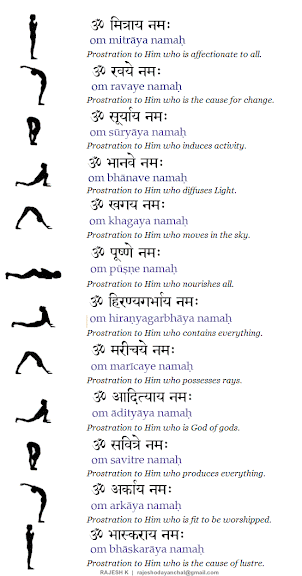
Surya Namaskar | Salutations to the Sun

Practicing sun salutations regularly can produce longevity, efficiency, strength and improve overall health. You can make your waist and spine flexible through sun salutations. You can tone up and beautify your arms and broaden your chest. If your spirit has started sagging lately, practice sun salutations to revive and rekindle your lost and drooping spirit.

Surya Namaskar is included in the regular routine of prayer and worship. Means it must be practiced regularly. Its greater importance has been described in the scriptures. As per the scriptures, a single day worship of the sun has virtues equivalent to the bestowal presentation of one lakh milk cows. Like worship, Surya Namaskaras too has their own significance. Surya Namaskara means prayer (Vandana) of Lord Surya. Surya Vandana is short. Surya Namaskara is an ancient system of Indian exercise. Stand facing the east at dawn and peacefully chant the mantras to pray Lord Surya and offer red sandals, flowers, rice grains (Akshatas) with water of simply the water alone as ARGHE (libation) and perform Surya Namaskara. This whole process must be performed before the sunrise is better.

Making difficult body movements becomes easy and your movements also become more graceful through practicing sun salutations. Unpleasant body odors are eradicated by Surya Namaskar. If your Adam’s apple has become abnormally prominent, it can be reduced through regularly performing sun salutations. Of course you can reduce your fat and get rid of love handles and beer belly through this exercise.

Even premature greying of hair and excessive hair fall can be arrested through sun salutations. Women can benefit a lot by practicing sun salutations. The process of child birth can become easier and hassle free or pain free and menstrual irregularity gets suppressed by regular practice of sun salutations.

If your breasts have started to sag, this exercise will stimulate the breast mass and restore firmness to your breasts, making them perkier. The pectoral muscles are strengthened and the glands are stimulated through this exercise. This helps to restore lost elasticity and improves the flexibility of muscles.

Skin disorders are prevented and the skin is refreshed through Surya Namaskar.
The function of the endocrine glands as well as that of the thyroid gland is normalized and your anxiety is calmed down through this exercise. It will even eliminate insomnia and promote deep sleep.

Your memory power is improved and the nervous system is toned up through sun salutations. Various kinds of toxic gases including carbon dioxide, and that too in large quantities are eliminated through the practice of Surya Namaskar. Thus this exercise is a kind of detoxifying agent for your body.

The blood is oxygenated and the lungs are thoroughly ventilated through the performance of this exercise. Even the muscles of your abdomen are strengthened. You can eliminate dyspepsia and constipation and activate your digestion and tone up the digestive system through Surya Namaskar.

For Devotees

The 12 Names of Surya – the Sun
1) Om Maitreya nam-ah       (The friend of all)
2)   Om Ravaye nam-ah         (Praised by all)
3)   Om Suryaya nam-ah       (The guide of all)
4)   Om Bhanave nam-ah      (The bestower of beauty)
5)   Om Khagaya nam-ah     (Stimulator of the senses)
6)   Om Pushne nam-ah        (The nourisher of all)
7)   Om Hiranyagarbhaya nam-ah   (The creator)
8)   Om Marichaye nam-ah   (Destroyer of disease)
9)   Om Adityaya nam-ah      (The inspirer)
10) Om Savitre nam-ah          (The purifier)
11) Om Arkaya nam-ah         (The radiant)
12) Om Bhaskaraya nam-ah    (The illuminator)

The 108 Names of Surya

Brahma once recounted to the sages the one hundred and eight sacred names of Surya. The Brahma Purana lists these names and we reproduce them in nine groups of twelve names each.

(1) Surya, Archana, Bhagavana, Tvashta, Pusha, Arka, Savita, Ravi, Gabhastimana, Aja, Kala, Mrityu.

(2) Dhata, Prabhakara, Prithivi, Jala, Teja, Akasha, Vayu, Parayana, Soma, Brihaspati, Shukra, Budha.

(3) Angaraka, Indra, Vivasvana, Diptamshu, Shuchi, Shouri,Shanaishvara, Brahma, Vishu, Rudra, Skanda, Vaishravana.

(4) Yama, Vaidyuta, Jathara, Agni, Aindhana, Tejohapti, Dharmadhvaja, Vedakarta, Vedanga, Vedavahana, Krita, Treta.

(5) Dvapara, Kali, Sarvasurashraya, Kala, Kashtha, Muhurta, Kshapa, Yama, Kshana, Samvatsara, Ashvattha, Kalachakra.

(6) Vibhavasu, Shashvata, Purusha, Yogi, Vyaktavyakta, Sanatana, Kaladhyaksha, Prajadhyaksha, Vishvakarma, Tamonuda, Varuna, Sagara.

(7) Amsha, Jimuta, Jivana, Ariha, Bhutashraya, Bhutapati, Sarvalokanamaskrita, Shrashta, Samvartaka, Vahni, Sarvadi, Alolupa.

(8) Anata, Kapila, Bhanu, Kamada, Sarvotamukha, Jaya, Vishala, Varada, Sarvabhutasevita, Mana, Suparna, Bhutadi.

(9) Shighraga, Pranadharana, Dhanvantari, Dhumaketu, Adideva, Aditinandana, Dvadashatma, Ravi, Daksha, Pita, Mata, Pitamaha.

See Video Tutorial

The benefits of Web Standards to your visitors, your clients and you!

  1. The Web Standards
  2. What are Web Standards about?
  3. A mindset change
  4. Semantically correct markup
  5. What is valid code?
  6. What is accessible code?
  7. Why use CSS to separate content from presentation?
  8. A CSS based site in action
  9. How do your VISITORS benefit from Web Standards?
  10. How do your CLIENTS benefit from Web Standards?
  11. How do YOU benefit from Web Standards?
  12. What are the downsides
  13. How do you achieve Web Standards?
  14. Conclusion
  15. Web Standards resources

പ്രവാസിയുടെ ദുഃഖം…

ഇന്നു രാവിലെ:
ഒരു ഇടിയപ്പത്തിന്‌(നൂല്‍‌പ്പുട്ട്) എട്ടു രൂപ; മൂന്നെണ്ണത്തിന്‌ 24 രൂപ!
ഇടിയപ്പത്തിന്റെ default കറി കടലക്കറിയത്രേ!! അതുകൊണ്ട് ചോദിക്കാതെ തന്നെ അതു കൂടെ കിട്ടും; അതിനു 15 രൂപ!!
ഒരു കുഞ്ഞു ഗ്ലാസില്‍ മുക്കാല്‍ ഭാഗം ചായ (കുറ്റം പറയരുതല്ലോ നല്ല രുചിയുള്ള പായസം പോലുള്ള ചായ), അതിന്‌ 7 രൂപ…
ആകെ 24 + 15 + 7 = 46 രൂപ…
50 രൂപ കൊടുത്തപ്പോള്‍ ഹോട്ടലുടമ പറഞ്ഞു ബാക്കി 4 രൂപ ഉച്ചക്കു തരാമെന്ന്…

ഇനി ഉച്ചയ്ക്ക്:
ചോറ്, എന്തൊക്കെയോ പച്ചക്കറികള്‍ കഴുകിയ വെള്ളത്തില്‍ ഉപ്പും പുളിയും ഒഴിച്ച് സാമ്പറെന്നു പേരുമിട്ടൊരു കറി, പറശ്ശിനിക്കടവ് മുത്തപ്പന്റെ പ്രസാദം പോലെ ഒരു പയറു കറി, ഒരു സ്പൂണ്‍ റെഡിമെയ്‌ഡ് അച്ചാര്‍, ഒരു പപ്പടം = 45 രൂപ!!

വൈകുന്നേരം: മൂന്നു ചപ്പാത്തി 24 രൂപ… എന്തോ ഭാഗ്യത്തിന്‌ കൂടെ കിട്ടുന്ന കറിയെന്നു പറയുന്ന സാധനത്തിനു പൈസയില്ല!!

ഇവിടെ ബാഗ്ലൂരില്‍ ഇങ്ങനെയൊക്കെയാണ് 🙁

CSS font shorthand rule

When styling fonts with CSS you may be doing this:
font-size: 1em;
line-height: 1.5em;
font-weight: bold;
font-style: italic;
font-variant: small-caps;
font-family: verdana,serif;

There’s no need though as you can use this CSS shorthand property:
font: 1em/1.5em bold italic small-caps verdana,serif

Much better! Just a couple of words of warning: This CSS shorthand version will only work if you’re specifying both the font-size and the font-family. Also, if you don’t specify the font-weight, font-style, or font-varient then these values will automatically default to a value of normal, so do bear this in mind too.

Why tables for layout is stupid:

Tables existed in HTML for one reason: To display tabular data. But then border=”0″ made it possible for designers to have a grid upon which to lay out images and text. Still the most dominant means of designing visually rich Web sites, the use of tables is now actually interfering with building a better, more accessible, flexible, and functional Web. Find out where the problems stem from, and learn solutions to create transitional or completely table-less layout.

The problem with using tables:

  • mixes presentational data in with your content.
    • This makes the file sizes of your pages unnecessarily large, as users must download this presentational data for each page they visit.
    • Bandwidth ain’t free.
  • This makes redesigns of existing sites and content extremely labor intensive (and expensive).
  • It also makes it extremely hard (and expensive) to maintain visual consistency throughout a site.
  • Table-based pages are also much less accessible to users with disabilities and viewers using cell phones and PDAs to access the Web.

Modern browsers are much better at rendering Web standards and we don’t need to use these archaic methods any more.

Instead of nesting tables within tables and filling empty cells with spacer GIFs, we can use much simpler markup and CSS to lay out beautiful sites that are faster to load, easier to redesign, and more accessible to everyone.

By using structural markup in our HTML documents and Cascading Style Sheets to lay out our pages, we can keep the actual content of our pages separated from the way they are presented.

This has several advantages over using tables….

Redesigns are easier and less expensive

By removing presentational markup from your pages, redesigns of existing sites and content is much less labor intensive (and much less expensive). To change the layout of the site, all you need to do is change the style sheets; you do not need to edit the pages themselves at all.

Using Web standards reduces the file sizes of your pages, as users no longer need to download presentational data with each page they visit. The Style sheets that control layout are cached by viewers’ browsers.

Reduced file size means faster loads and lower hosting costs.

Using Web standards also makes it extremely easy to maintain visual consistency throughout a site. Since pages use the same CSS document for their layout, they are all formatted the same.

This strengthens your brand and makes your site more usable.

Using Web standards makes our pages much more accessible to users with disabilities and to viewers using mobile phones and PDAs to access the Web.

Visitors using screen readers (as well as those with slow connections) do not have to wade through countless table cells and spacers to get at the actual content of our pages.

In other words, separating content from the way it is presented makes your content device-independent.

Speaking of accessiblity, minimizing your markup and using header tags properly will also help improve your search engine ranking.

Reducing the ratio of code to content, using keywords in your header tags, and replacing header GIFs with actual text will all help your sites get better search engine results.

    IE and width & height issues

    IE has a rather strange way of doing things. It doesn’t understand the min-width and min-height commands, but instead interprets width and height as min-width and min-height – go figure!

    This can cause problems, because we may need boxes to be resizable should more text need to go in them or should the user resize text. If we only use the width and height commands on a box then non-IE browsers won’t allow the box to resize. If we only use the min-width and min-height commands though then we can’t control the width or height in IE!

    This can be especially problematic when using background images. If you’re using a background image that’s 80px wide and 35px high, then you’ll want to make sure that the default size for a box using this image is exactly 80 x 35px. However, if users resize the text then the box size will need to expand gracefully.

    To resolve this problem, you can use the following code for a box with class=”box”:

    .box
    {
    width: 80px;
    height: 35px;
    }

    html>body .box
    {
    width: auto;
    height: auto;
    min-width: 80px;
    min-height: 35px;
    }

    All browsers will read through the first CSS rule but IE will ignore the second rule because it makes use of the child selector command5. Non-IE browsers will read through the second one and will override the values from the first rule because this CSS rule is more specific, and CSS rules that are more specific always override those that are less specific.

    Minimum width for a page

    A very handy CSS command that exists is the min-width command, whereby you can specify a minimum width for any element. This can be particularly useful for specifying a minimum width for a page.

    Unfortunately, IE doesn’t understand this command, so we’ll need to come up with a new way of making this work in this browser. First, we’ll insert a

    under the tag, as we can’t assign a minimum width to the :

    Next we create our CSS commands, so as to create a minimum width of 600px:

    #container
    {
    min-width: 600px;
    width:expression(document.body.clientWidth < 600? "600px": "auto" );
    }

    The first command is the regular minimum width command; the second is a short JavaScript command that only IE understands. Do note though, this command will cause your CSS document to invalidate so you may prefer to insert it into the head of each HTML document to get round this.

    You might also want to combine this minimum width with a maximum width:

    #container
    {
    min-width: 600px;
    max-width: 1200px;
    width:expression(document.body.clientWidth < 600? "600px" : document.body.clientWidth > 1200? “1200px” : “auto”);
    }