
ഇങ്ക്‌സ്കേപ്പ് എന്ന സോഫ്റ്റ്‌വെയറിനെ പരിചയപ്പെടാം

അഡോബിന്റെ ഫോട്ടോഷോപ്പ്, കോറലിന്റെ കോറൽഡ്രോ തുടങ്ങി നിരവധി ഗ്രാഫിക്സ് എഡിറ്റിങ് സോഫ്‌റ്റ്‌വെയറുകൾ മാർക്കറ്റിൽ ലഭ്യമാണ്. റാസ്റ്റർ ഇമേജ് എഡിറ്റിങ് (raster image editing) വെക്റ്റർ ഇമേജ് എഡിറ്റിങ് (vector image editing) എന്നിങ്ങനെ പ്രധാനമായും രണ്ടായി ഇവയെ തരം തിരിച്ചിരിക്കുന്നു. ഫോട്ടോഷോപ്പ് റാസ്റ്റർ ഇമേജ് എഡിറ്റിങിൽ പെട്ട സോഫ്റ്റ്‌വെയർ ആണ്. ഫോട്ടോസ് ഒക്കെ മെച്ചപ്പെടുത്താനും മിക്സ് ചെയ്യാനും പോലുള്ള പരിപാടികൾക്കിതാണു നല്ലത്. ചിത്രം വലുതാക്കുമ്പോൾ അതിന്റെ വ്യക്തത നഷ്ടപ്പെടുന്നു എന്നതാണ് റാസ്റ്റർ ഇമേജ് എഡിറ്റിങിന്റെ ന്യൂനത. ഫ്രീ സോഫ്‌റ്റ്‌വെയറായ ജിംബ് ഫോട്ടോഷോപ്പിന്റെ നല്ലൊരു എതിരാളിയാണ്.

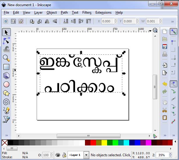
എത്രതന്നെ വലുതാക്കിയാലും വ്യക്തത അല്പം പോലും കുറയാത്ത ചിത്രങ്ങൾ ഉണ്ടാക്കാൻ വെക്റ്റർ എഡിറ്റിങ് സോഫ്റ്റ്‌വെയറുകൾ വേണം. കോറൽഡ്രോ ആണ് ഈ രംഗത്ത് ഒന്നാമൻ. ഇങ്ക്‌സ്കേപ്പ് ഒരു വെക്റ്റർ എഡിറ്റിങ് സോഫ്‌റ്റ്‌വെയർ ആണ്. ഇതൊരു ഒരു ഫ്രീ സോഫ്‌റ്റ്‌വെയർ കൂടിയാണ്. മാർക്കറ്റിലെ ഒന്നാമനായ കോറൽ‌ഡ്രോയോട് കിടപിടിക്കാൻ ഇങ്ക്‌സ്കേപ്പിനു പറ്റില്ലെങ്കിലും അതിനെ അപേക്ഷിച്ച് മറ്റു പല സവിശേഷതകൾ ഈ സോഫ്‌റ്റ്‌വെയറിനുണ്ട്. അതിലൊന്നാണ് മലയാളം പോലുള്ള സങ്കീർണ ലിപികൾ നമുക്കിതിൽ ഉപയോഗിക്കാൻ പറ്റുന്നു എന്നത്. മാത്രമല്ല, വിൻഡോസ്, ലിനക്സ്, മാക്സ്  തുടങ്ങിയ ഓപ്പറേറ്റിങ് സിസ്റ്റങ്ങളില്ലാം ഇതു പ്രവർത്തിക്കുന്നതുമാണ്.

വെബ്‌ടെക്നോളജിയുമായി ബന്ധപ്പെട്ടുകഴിയുന്നവർക്ക് സുപരിചിതമായ എക്സ്.എം.എൽ , എസ്.വി.ജി, സി.എസ്.എസ്. മാനദണ്ഡങ്ങൾ അനുസരിച്ചാണിതിൽ ചിത്രങ്ങൾ ഉണ്ടാക്കുന്നത്. അതായത് ഇങ്ക്‌സ്കേപ്പിൽ ഉണ്ടാക്കിയ ഒരു  എസ്.വി.ജി ഫയൽ നിങ്ങൾക്കുവേണമെങ്കിൽ നോട്ട്പാഡ് പോലുള്ള ടെക്സ്റ്റ് എഡിറ്റർ ഉപയോഗിച്ച് തുറക്കാനും മാറ്റം വരുത്താനും സാധിക്കും…!

മറ്റേതൊരു ഇമേജ് എഡിറ്റിങ് സോഫ്‌റ്റ്‌വെയറുകളിലേതെന്നപോലെ ടൂൾബോക്സും, ലേയർ കൺസെപ്റ്റും ഒക്കെ ഇതിലും ഉണ്ട്. ഏതെങ്കിലും ഒരു ഇമേജ് എഡിറ്റിങ് സോഫ്‌റ്റ്‌വെയർ അറിയുന്ന ഒരാൾക്ക് കേവലം രണ്ടോ മൂന്നോ ദിവസത്തെ പരിശീലനം കൊണ്ട് ഇങ്ക്സ്കേപ്പിൽ മാസ്റ്റർ ആവാൻ പറ്റും.

വിക്കിപീഡിയയിൽ തുടങ്ങിയ ഭൂപടനിർമ്മാണം എന്ന പദ്ധതിയുമായി ബന്ധപ്പെട്ടാണ് ഞാൻ ഈ സോഫ്‌റ്റ്‌വെയറിനെ പരിചയപ്പെടുന്നത്. പിന്നീട് ഈ സോഫ്‌റ്റ്‌വെയർ ഉപയോഗിച്ച് വിക്കിപീഡിയയ്‌ക്കുവേണ്ടി നിരവാധി ഭൂപടങ്ങൾ നിർമ്മിക്കുകയിണ്ടായി. കേരളത്തിലെ വിവിധ ജില്ലകളുടേയും മറ്റും ഭൂപടങ്ങൾ വരച്ചത് ഇവിടെ ക്ലിക്ക് ചെയ്താൽ കാണാവുന്നതാണ്. ഈ സോഫ്റ്റ്‌വെയർ പഠിക്കാനാവശ്യമായ ടൂട്ടോറിയലുകൾ നെറ്റിൽ തന്നെ ലഭ്യമാണ്. മലയാളത്തിൽ ടൂട്ടോറിയലുകൾ ഒന്നുംതന്നെ ഇതുവരെ ശ്രദ്ധയിൽ പെട്ടിട്ടില്ല. വെക്റ്റർഗ്രാഫിക്സുമായി കളിക്കുന്നവർക്ക് തെരഞ്ഞെടുക്കാൻ പറ്റിയ വലരെ സിമ്പിൾ ആയിട്ടുള്ള ഒരു ഫ്രീ സോഫ്റ്റ്‌വെയർ ആണിത്.

Kerala-administrative-divisions-map-enനിങ്ങളുടെ ഓപ്പറേറ്റിങ് സിസ്റ്റം ഏതാണെന്നു നോക്കി അതിനാവശ്യമായ ഇങ്ക്‌സ്കേപ്പ് ഡൗൺലോഡു ചെയ്തുപയോഗിക്കുക. ഇത് സിസ്റ്റത്തിൽ ഇൻസ്റ്റാൾ ചെയ്യണമെന്നു നിർബന്ധമില്ല. വെറുതേ കോപ്പിചെയ്തിട്ടാലും വർക്ക് ചെയ്യും. മറ്റു ഗ്രാഫിക്സ് സോഫറ്റ്‌വെയറുകളെ അപേക്ഷിച്ച് മെമ്മറി വളരെ കുറച്ചുമാത്രമേ ഇങ്ക്‌സ്കേപ്പിന് ആവശ്യമുള്ളൂ.

ഇങ്ക്‌സ്കേപ്പ് ഡൗൺലോഡ് ചെയ്യാൻ ഈ സൈറ്റിലേക്കു പോവുക. ഓപ്പറേറ്റിങ് സിസ്റ്റത്തിന് അനിയോജ്യമായ ഇങ്ക്സ്കേപ്പ് തന്നെ സെലക്റ്റ്‌ചെയ്യാൻ ശ്രദ്ധിക്കുക.

ഉപയോഗിച്ചുതുടങ്ങുന്നവർ ഇതിൽ നിന്നും ഏതെങ്കിലും ഒരു എസ്.വി.ജി. ഫയൽ ഡൗൺലോഡ് ചെയ്തിട്ട് ഇങ്ക്‌സ്കേപ്പിൽ ഓപ്പൺ ചെയ്തു നോക്കുക. ഈ ലിസ്റ്റിൽ പി.എൻ.ജി. എക്സ്റ്റൻഷൻ ഉള്ള ഫയലുകളും ഉണ്ട്. അതു തിരിച്ചറിയാൻ അഡ്രസ്‌ബാറിലെ അവയുടെ പേര് ശ്രദ്ധിച്ചാൽ മതി. .svg എക്സ്റ്റൻഷൻ ഉള്ള ഫയലുകൾ ഡൗൺലോഡ് ചെയ്യുക. കേരളത്തിന്റെ അഡ്‌മിൻസ്ട്രേറ്റീവ് ഭൂപടം ഇങ്ക്‌സ്കേപ്പിൽ വരച്ചതു നോക്കുക. ഇത് Save As ചെയ്തെടുത്താലും മതി. എന്നിട്ട് അത് ഒരു നോട്ട്പാഡിൽ ഓപ്പൻ ചെയ്തു നോക്കൂ!! ഉപയോഗിച്ച് തുടങ്ങുമ്പോൾ വരുന്ന സംശയങ്ങൾ ചോദിക്കാൻ മറക്കരുത്…

ചില പൊടിക്കൈകൾ

  • ഫോട്ടോഷോപ്പ് പോലുള്ള സോഫ്റ്റ്‌വെയറുകൾ പരിചരിച്ചുവന്നവർ ആദ്യം അന്വേഷിക്കുക ഇതിന്റെ ലേയറുകൾ എവിടെ കിട്ടും എന്നാവും. ഒന്നിനുപുറകിൽ മറ്റൊന്നായി ചിത്രങ്ങളും ടെക്സ്റ്റുകളും അടുക്കിവെയ്ക്കാൻ അത് കൂടിയേ തീരൂ. മെനുവിൽ ലേയർ എന്ന മെനു ഐറ്റത്തിൽ അവസാനത്തേതായി ലെയർ മെനുഐറ്റം ഉണ്ട്, Ctrl + Shift + L അമർത്തിയാൽ ലേയർ വിൻഡോ വരുന്നതുകാണാം. Ctrl + Shift + N ആണ് പുതിയ ലേയർ കൂട്ടിച്ചേർക്കാനുള്ള ഷോർട്ക്കട്ട് കീ.
  • കീബോർഡിൽ നമ്പർ 5 പ്രസ്സ് ചെയ്താൽ ഫിറ്റ് ടു സ്ക്രീൻ എന്ന ഓപ്ഷൻ ലഭിക്കും. എഡിറ്റ് ചെയ്തുകൊണ്ടിരിക്കുന്ന ഡോക്കുമെന്റ് സ്ക്രോൾ ചെയ്തുപോയി സ്ക്രീനിനുപുറത്തേക്ക് പോയാൽ തിരിച്ചുകൊണ്ടുവരാനുള്ള ഒരു എളുപ്പ മാർഗമായി ഇതിനെ കാണാം. ഇനി നമ്പർ 1, 2, 6 എന്നിവ കൂടി അമർത്തി നോക്കൂ!!
  • ഡോക്കുമെന്റിന്റെ വിഡ്ത്, ഹൈറ്റ്, റസലൂഷൻ തുടങ്ങിയ പ്രോപ്പർട്ടീസ് മാറ്റണമെങ്കിൽ അതിനുള്ള മാർഗം ഫയൽ മെനുവിൽ ഡോക്കുമെന്റ് പ്രോപ്പർട്ടീസ് എടുത്താൽ കിട്ടും. എളുപ്പത്തിൽ Ctrl + Shift + D അമർത്തിയാൽ മതി.
  • ഒരു ഒബ്ജക്റ്റിന്റെ, അല്ലെങ്കിൽ ടെക്സ്റ്റിന്റെ കോപ്പിയെടുത്ത് പേസ്റ്റ് ചെയ്യേണ്ടതെങ്ങനെയെന്ന് സാധാരണഗതിയിൽ ഏവർക്കും അറിയുമായിരിക്കുമല്ലോ! അതുകൂടാതെ ഇങ്ക്‌സ്കേപ്പിൽ ഒരു എളുപ്പമാർഗമുള്ളത് Ctrl + D ആണ്. സെലെക്റ്റ് ചെയ്തിരിക്കുന്ന ഒബ്ജക്റ്റ് ഏതുതന്നെയായാലും അതിന്റെ ഡ്യൂപ്ലിക്കേറ്റ് അതിനു മുകളിലായി വന്നിരിക്കും!! മൗസ് ഉപയോഗിച്ച് ഇനി അതിനെ അവിടെ നിന്നും വലിച്ചു മാറ്റിവെച്ചാൽ മതിയാവും!
  • ട്രാൻസ്പരന്റ് ഇമേജാണു ലക്ഷ്യമെങ്കിൽ ഫയലിൽ Export Bitmap ക്ലിക്ക് ചെയ്തു സേവ് ചെയ്താൽ മതിയാവും. Ctrl + Shift + E ആണ് എളുപ്പവഴി. അവിടെ കാണുന്ന മറ്റ് ഓപ്ഷൻസ് ശ്രദ്ധിക്കുക. ഡോക്കുമെന്റിൽ ഒരുകൂട്ടം ഒബ്‌ജക്റ്റുകൾ ഉണ്ടെങ്കിൽ അവയിലെ രണ്ടോ മൂന്നോ ഒബ്ജക്റ്റ് മാത്രമായും ഇങ്ങനെ എക്സ്പോർട്ട് ചെയ്യാവുന്നതാണ്!!
  • Alt + Ctrl + A പ്രസ്സ് ചെയ്താൽ മുഴുവൻ ലേയറുകളിലേയും എല്ലാ ഒബ്ജക്റ്റിനേയും സെലെക്റ്റ് ചെയ്യാനാവും.

വെക്റ്റർ ഗ്രാഫിക്സിൽ ചെയ്യാൻ പറ്റുന്ന ഒട്ടനവധി സംഗതികൾ വേറെയും ഉണ്ട്. അവ ഓരോന്നായി ചെയ്തു ശീലിക്കുക. ഇങ്ക്സ്കേപ്പിന്റെ വിവിധവശങ്ങളെ കുറിച്ച് പ്രതിപാദിക്കുന്ന വിശദമായ ടൂട്ടോറിയൽസ് ആവശ്യമുള്ളവർ ഈ സൈറ്റിലേക്കു പോവുക!

റൈറ്റ് സൈഡ് ചാറ്റിങ് | Techies Tricks

ഗൂഗിളിന്റെ സേവനം തേടാത്തവരായി നെറ്റില്‍ ആരും തന്നെ കാണികയില്ല. സേര്‍ച്ച് എഞ്ചിന്‍, മെയില്‍ സര്‍‌വീസ്, ഫോട്ടോ ആല്‍ബം, വീഡിയോഷെയറിങ് തുടങ്ങി വ്യത്യസ്തങ്ങളായ പല സേവനങ്ങലിലൂടെ ഗൂഗിള്‍ ജൈത്രയാത്ര തുടരുന്നു. ഗൂഗിളിനെ മെയില്‍ സര്‍‌വീസായ ജീമെയിലില്‍ ഉള്ള ഒരു സം‌വിധാനമാണ്‌ ജിമെയില്‍ ലാബ്‌സ്. 2008 ജൂണില്‍ തുടങ്ങിയ ഈ സൗകര്യം, 2011 സെപ്‌റ്റംബറില്‍ ഗൂഗിള്‍ നിര്‍ത്തിവെയ്‌ക്കും എന്നു പറഞ്ഞിരുന്നുവെങ്കിലും ഇതുവരെ നിര്‍ത്തിവെച്ചിട്ടില്ല. ജിമെയിൽ സേവനത്തിന്റെ ഒരു പരീക്ഷണശാലയാണ് ജിമെയിൽ ലാബ്സ് എന്നു വേണമെങ്കില്‍ പറയാം. നിരവധി പുതിയ സൗകര്യങ്ങൾ ഉപയോക്താക്കൾക്ക് ലാബ്സിൽ പോയി പരീക്ഷിച്ചു നോക്കാവുന്നതാണ്.  അതില്‍ ഒന്നാണ്‌ റൈറ്റ്‌സൈഡ് ചാറ്റിങ്.

റൈറ്റ് സൈഡ് ചാറ്റിന്റെ പറ്റി മതിയായ ചിത്രങ്ങൾ അടക്കം വിശദമായി ഇവിടെ കൊടുത്തിരിക്കുന്നു…

ചില സൂത്രപ്പണികൾ | Techies Tricks

ഒരു ഫോൾ‌ഡറിലുള്ള എല്ലാ ഫയലുകളുടേയും ഫോൾഡറുകളുടേയും ലിസ്റ്റ് എടുക്കണം എന്നുള്ളവർക്ക് ഏറ്റവും എളുപ്പത്തിൽ അതു സാധ്യമാക്കാനുള്ള ഒരു വിദ്യയാണു താഴെ കൊടുത്തിരിക്കുന്നത്. 
ഒരു ഫോൾഡറിൽ നിറയെ സിനിമകൾ ഉണ്ടെങ്കിൽ അവയുടെ ലിസ്റ്റ് എടുക്കുന്ന രീതി വെച്ചാണ് താഴെ ഈ സൂത്രപണി വിശദീകരിച്ചിരിക്കുന്നത്. നിങ്ങളുടെ കയ്യിലുള്ള PDF ഫയകുകളുടെ ലിസ്റ്റ്, പാട്ടുകളുടെ ലിസ്റ്റ് എന്നിങ്ങലെ ഏതു ഫയലുകളുടേയും പേരുകൾ ഇതുവഴി ലിസ്റ്റ് ചെയ്യാനാവും. 
ഇത് ഗൂഗിൾ ബസ്സിലും ഗൂഗിൾ പ്ലസ്സിലും അതുപോലെ ഫെയ്‌സ്ബുക്കിലും ഒക്കെയായി ഷെയർ ചെയ്തിട്ടുണ്ട്. അവിടെ കൊടുത്തിരിക്കുന്ന കമന്റുകളിൽ നിന്നും ഇതുമായി ബന്ധപ്പെട്ട കൂടുതൽ കാര്യങ്ങൾ മനസിലാക്കാൻ സാധിക്കുമെന്നും കരുതുന്നു.
ട്രിക്കിതാണ്
എന്റെ കൈയിൽ ഒരു 1 TB യുടെ എക്‌സ്റ്റേണൽ ഹാർഡ് ഡിസ്‌ക്ക് ഉണ്ടെന്നു കരുതുക…
ഹാർഡ്‌ ഡിസ്‌ക്കിന്റെ Drive Letter F: ആണെന്നു കരുതുക
ഹാർഡ് ഡിസ്‌ക്കിൽ MalyalamFilms എന്നൊരു ഫോൾഡർ ഉണ്ടെന്നും കരുതുക
ആ ഫോൾഡറിൽ 482 മലയാളം സിനിമകൾ ഉണ്ടെന്നും ചുമ്മാതങ്ങ് കരുതുക

ഇനി
1. ഈ സിനിമയുടെ പേരുകളൊരു ലിസ്റ്റായി എടുക്കാൻ നിങ്ങൾക്ക് ആഗ്രഹമുണ്ട് എന്നു കരുതുക

2. കൂട്ടുകാർക്ക് കാണിക്കാൻ വേണ്ടി നോട്പാഡിലോ മറ്റോ ഈ പേരൊക്കെ 1 ബൈ 1 ആയി എഴുതി വെയ്‌ക്കണം എന്നാഗ്രഹം ഉണ്ടെന്നു കരുതുക

3. ഇതൊക്കെ കുത്തിപ്പിടിച്ചിരുന്നു നോട്ട്പാടിലേക്ക് ടൈപ്പ് ചെയ്തെടുക്കാൻ നല്ല മടി ഉണ്ടെന്നു കരുതുക

എന്തു ചെയ്യണം
വിൻഡോസുപയോഗിക്കുന്നവർക്ക് ഒരു മന്ത്രം ഡോസേ ശരണം ഗച്ചാമി!

1. Start – ഇൽ ക്ലിക്ക് ചെയ്തിട്ട് XP ക്കാർ RUN ലും വിൻ7/വിസ്തക്കാർ Search Programs and Files എന്ന സ്ഥലത്തു ക്ലിക്ക് ചെയ്യുക
2. അവിടെ CMD എന്നു കൊടുത്ത് എന്റർ അടിച്ച്  കമാൻഡ്‌ പ്രോംപ്റ്റ് ഓപ്പൺ ചെയ്യുക…

ആ പഴയ കറുത്ത വിൻഡോ വന്നു!!
അതിൽ c:users ഇൽ ആയിരിക്കും നിങ്ങളിപ്പോൾ നിൽക്കുന്നത്.

ഓർക്കുക : Drive Letter F:, Folder Name MalyalamFilms ഇതിലാണു സിനിമകൾ!!

പണി ഇത്രേ ഉള്ളൂ

1. അങ്ങോട്ട് പോവാൻ കമാൻഡ്‌ പ്രോംപ്‌റ്റിൽ F: എന്നു ടൈപ്പ് ചെയ്തിട്ട് എന്റെർ അടിക്കുക
2. പിന്നെ CD  MalyalamFilms എന്നു കൂടി കൊടുക്കുക
3. ഇനി dir /b > %USERPROFILE%DesktopfilmNames.txt ഇങ്ങനെ കൂടി കൊടുക്കുക

സംഭവം ക്ലീൻ!!

ഇനി ഡസ്‌ക്‌ടോപ്പിൽ നോക്കൂ  filmNames.txt എന്ന ഫയൽ അവിടെ പുതിയതായി വന്നിരിക്കുന്നത് കാണാം. ആ ഫയൽ ഓപ്പൺ ചെയ്തു നോക്കൂ!!!

HTML5

നെറ്റിലൂടെയുള്ള ആശയവിനിമയത്തിനു ചുക്കാന്‍ പിടിക്കുന്ന വളരെ ലളിതമായ ഒരു കമ്പ്യൂട്ടര്‍ ഭാഷയാണ് HTML. ഈ അടുത്ത് ഇറങ്ങിയ HTML5 ആണ് HTML -ന്റെ പരിഷ്കരിച്ച അവസ്സന പതിപ്പ്. ഒരുപാട് പുതിയ ടാഗുകളും എപിഐ കളും ഉള്‍ക്കൊള്ളിച്ചുകൊണ്ട് വളരേ നൂതനമായൊരു ബ്രൗസിംങ് അനുഭവം പ്രദാനം ചെയ്യാന്‍ HTML5 നു കഴിയും എന്നു വേണം കരുതാന്‍. HTML 4.01, XHTML 1.0 , DOM Level 2 HTML ഇവയ്ക്കു ശേഷം ഇറങ്ങിയ അടുത്ത വെബ്‌സ്റ്റാന്‍‌ഡേര്‍ഡായിട്ടാണ്‌ HTML5 ഇറങ്ങിയിരിക്കുന്നത്. Flash, Silverlight, Java തുടങ്ങിയ RIA Technologies നെ കുറിച്ചുള്ള വേവലാതി ഇനി വേണ്ട. ഇവ സപ്പോര്‍‌ഡ് ചെയ്യാനുതകുന്ന ടാഗുകളും അതിനു വേണ്ട എപിഐ കളും HTML5 നോടൊപ്പം കൂട്ടിച്ചേര്‍ത്തിരിക്കുന്നു. ഔദ്യോഗികമായി ഇതു പുറത്തിറങ്ങിയെങ്കിലും HTML5 സ്റ്റാന്‍ഡേഡൈസേഷന്‍ വരും വര്‍ഷങ്ങളിലും തുടരും. എല്ലാ ബ്രൗസറുകളും HTML5 ലെ എല്ലാ ടാഗുകളെയും സപ്പോര്‍ട്ട് ചെയ്‌തു തുടങ്ങിയിട്ടില്ല. എങ്കിലും മോസില്ല, ഗൂഗിള്‍ ക്രോം എന്നിവയില്‍ HTML5 ശക്തി വളരേ പ്രകടമായി കാണാവുന്നതാണ്. ഇന്റെര്‍നെറ്റ് എക്സ്പ്ലോറര്‍ എന്ന മൈക്രോസോഫ്‌റ്റ് ബ്രൗസറിന്റെ പരിഷ്‌കരിച്ച പതിപ്പായ ഇന്റെര്‍നെറ്റ് എക്സ്പ്ലോറര്‍ 9 – ഇല്‍ ആണ് HTML5 ന്റെ പ്രകടനം താരതമ്യേന വളരേ കുറവാണ്.

CSS Positioning

Position:Static

The default positioning for all elements is position:static, which means the element is not positioned and occurs where it normally would in the document.
Normally you wouldn’t specify this unless you needed to override a positioning that had been previously set.

#div-1 {   
position:static; }


Position:Relative

If you specify position:relative, then you can use top or bottom, and left or right to move the element relative to where it would normally occur in the document.

Let’s move div-1 down 20 pixels, and to the left 40 pixels:

#div-1 {   
position:relative;
top:20px;
left:-40px; }

Notice the space where div-1 normally would have been if we had not moved it: now it is an empty space. The next element (div-after) did not move when we moved div-1. That’s because div-1 still occupies that original space in the document, even though we have moved it.

It appears that position:relative is not very useful, but it will perform an important task later in this tutorial.

Position:Absolute

When you specify position:absolute, the element is removed from the document and placed exactly where you tell it to go.

Let’s move div-1a to the top right of the page:

#div-1a {   
position:absolute;
top:0;
right:0;
width:200px; }

Notice that this time, since div-1a was removed from the document, the other elements on the page were positioned differently: div-1b, div-1c, and div-after moved up since div-1a was no longer there.

Also notice that div-1a was positioned in the top right corner of the page. It’s nice to be able to position things directly the page, but it’s of limited value.

What I really want is to position div-1a relative to div-1. And that’s where relative position comes back into play.

Footnotes
  • There is a bug in the Windows IE browser: if you specify a relative width (like “width:50%”) then the width will be based on the parent element instead of on the positioning element.
Position:Relative + Position:Absolute

If we set relative positioning on div-1, any elements within div-1 will be positioned relative to div-1. Then if we set absolute positioning on div-1a, we can move it to the top right of div-1:

#div-1 {   
position:relative; }


#div-1a {
position:absolute;
top:0;
right:0;
width:200px; }
Two Column Absolute

Now we can make a two-column layout using relative and absolute positioning!

#div-1 {   
position:relative; }


#div-1a {
position:absolute;
top:0;
right:0;
width:200px; }


#div-1b {
position:absolute;
top:0;
left:0;
width:200px; }

One advantage to using absolute positioning is that we can position the elements in any order on the page, regardless of the order they appear in the HTML. So I put div-1b before div-1a.

But wait – what happened to the other elements? They are being obscured by the absolutely positioned elements. What can we do about that?


float

For variable height columns, absolute positioning does not work, so let’s come up with another solution.

We can “float” an element to push it as far as possible to the right or to the left, and allow text to wrap around it. This is typically used for images, but we will use it for more complex layout tasks (because it’s the only tool we have).

#div-1a {   
float:left;
width:200px; }
float columns

If we float one column to the left, then also float the second column to the left, they will push up against each other.

#div-1a {  
float:left;
width:150px; }


#div-1b {
float:left;
width:150px; }

float columns with clear

Then after the floating elements we can “clear” the floats to push down the rest of the content.

#div-1a {   
float:left;
width:190px; }


#div-1b {
float:left;
width:190px; }


#div-1c {
clear:both; }

Selector syntax

A simple selector is either a type selector or universal selector followed immediately by zero or more attribute selectors, ID selectors, or pseudo-classes, in any order. The simple selector matches if all of its components match.

A selector is a chain of one or more simple selectors separated by combinators. Combinators are: whitespace, “>”, and “+”. Whitespace may appear between a combinator and the simple selectors around it.

The elements of the document tree that match a selector are called subjects of the selector. A selector consisting of a single simple selector matches any element satisfying its requirements. Prepending a simple selector and combinator to a chain imposes additional matching constraints, so the subjects of a selector are always a subset of the elements matching the rightmost simple selector.

One pseudo-element may be appended to the last simple selector in a chain, in which case the style information applies to a subpart of each subject.

Rounded Corners

When New WordPress started using this i though you know Internet Explorer is definitely out now when i’m doing some css work that needs rounded corners I’m mostly using only this technique because buyers are ok with it although it’s just for FireFox and Safari. And since most of people still don’t know about this i figured it’s good thing to share.

Of course i’m talking about Border-radius property for FireFox and Safari 3 (only). And here are some nice examples how to use it.

#box { background: #eee; border: 1px solid #ccc; padding: 15px; -moz-border-radius: 10px; -webkit-border-radius: 10px; }

And of course you don’t have to make all corners rounded, it can be just top left etc, so the code goes like this (small not, for example you can’t make rounded corners on images and stuff like that)

* -moz-border-radius-topleft and -webkit-border-top-left-radius
* -moz-border-radius-topright and -webkit-border-top-right-radius
* -moz-border-radius-bottomleft and -webkit-border-bottom-left-radius
* -moz-border-radius-bottomright and -webkit-border-bottom-right-radius

Kerala Help line numbers

അത്യാവശ്യം വരുന്ന നമ്പറുകൾ കുറിച്ചെടുത്ത് മൊബൈൽ ഫോണിൽ സൂക്ഷിച്ചാൽ നല്ലതായിരിക്കും. യാത്രകളിൽ, പ്രത്യേകിച്ച് ആദ്യമായി ഒരു സ്ഥലത്തേക്ക് പോകുമ്പോൾ ഇതൊക്കെ അത്യാവശ്യം തന്നെയാണ്.

Nearest Police station 100
Police   Helpline 0471-324 3000/4000/5000
Police High Way Help Line 9846 100 100
Fire Station 101
Ambulance 108
Crime Stopper 1090
Women Helpline 1091
Child Line 1098
Trivandrum Medical College www.tmc.kerala.gov.in
MCH Casualty : (24 hrs) 0471-2528300
Consumer Toll Free Helpline 18004251550
Food Adulteration Helpline 1800 425 1125 (Toll free)
Anti-Ragging Helpline 1800 180 5522(Toll free)
Online Enquiry: www.antiragging.in
Highway Alert 9846 100 100
Rail Alert 9846 200 100
SMS Centre 9497 900 000
K.S.R.T.C Helpline Numbers 09447570203/09846236020
09387697244
K.S.R.T.C Control Room (24×7) 0471-2463799 /09447071021
K.S.R.T.C Complaints and Grievances (Vigilance officer) 9447071017
Citizens Call Centre 0471-2115054/98, 2335523
BSNL Land Line: 155300
BSNL Mobile: 0471-155300
Tourist Information toll free
1-800-425-4747
Forest Helpline BSNL Land Line: 155 300
BSNL Mobile:
0471 155 300
Other Networks:

0471 211 5054/98, 2335523
Disaster Management Helpline 1077 (Collectorates)
1070
(State Control Room)
Labour Minister’s Helpline 155 300
Sutharya Keralam 155 300
Chief Minister’s Distress Relief Fund
( CMDRF )
0471-2518513/0471-2518487/
0471-2518795/0471-2518332
CM’s Grievance Redressal Cell 155 300
PSC Information 155 300
NORKA ROOTS Call Centre 1800 425 3939 (Toll free)
0091 471 233 3339
(From abroad)
PWD Helpline 1800 425 7771
Helpline to nab Garbage offenders 9496434517
(Only for Thiruvananthapuram)
Kerala Water Authority
Emergency 0471-2322674
Complaints 155313 (toll free)
Helpline 2328654 – extn. 400
2328992 – extn.400
Commercial Taxes 1800 425 4777 (Toll free)
9446505527 (Mobile)
E-mail:
vathelpline@keralataxes.gov.in This e-mail address is being protected from spambots. You need JavaScript enabled to view it
Election  Helpline 1950
Chief Electoral Officer Control Room: 0471- 2301080
Fax: 0471- 2301081
E-mail: ceo_kerala@eci.gov.in This e-mail address is being protected from spambots. You need JavaScript enabled to view it
Nirbhaya Helpline 1800 452 140 (Toll free No)
LPG HELPLINES & GRIEVANCE REDRESSAL
LPG Transparency Portal www.petroleum.nic.in
Indian Oil Customer Service Cell- Ernakulam, Idukki, Trivandrum, Kollam, Kottayam, Allapuzha, Pathanamthitta 0484-2310859
Indian Oil Customer Service Cell- Kozhikode, Malappuram, Thrissur, Kannur, Kasargode, Palakkad, Wayanad 0495-2370213
Bharat Petroleum Corporation Ltd.
LPG Customer Helpline, Thiruvananthapuram
0471-2705202
Hindustan Petroleum Corporation Ltd.
LPG Customer Helpline- All districts
0484-2392074
LPG -Complaint Number (All gas agencies)
Thiruvananthapuram City
0471 2730045, 2730067
INCOME TAX INDIA www.incometaxindiaefiling.gov.in
Call Center  for General Query 1961 18001801961
E-filing Call Center
(for e-filing of return)
080-26982000
CPC Call Center 1800-425-2229


100% height model css?

I had been looking around for a way to accomplish fixed header and footer on a website when scrolling, and somehow i haven’t got it right with background attachment: fixed, neither i got it with absolute position…

I have a main Div called wrapper, inside there are three main Divs: header, content and footer, and each one of them has sub Divs inside for the content of each one. So the structure goes something like this in general terms:

body[

[ Div:wrapper
Div:Header
Div:top-banner
Div:Menu
Div:Buttons
]
[Div:Content]

[Div:Footer
Div:bottom-banner
]
]

is there any way to accomplish that the header and footer remain “locked” at the top and bottom of the browser window and only the content scrolls down.

See Here is the proper solution:

html, body {
height: 100%;
}

body {
any other styles;
}

#container {
min-height: 100%;
other styles;
}
* html #container {height: 100%;}/*IE6*/

this way, your page start out 100% but can grow bigger as content demands.

×

Hello!

താഴെ കാണുന്ന വാട്സാപ്പ് ഐക്കൺ ക്ലിക്ക് ചെയ്യുകയോ ഈ മെയിൽ ഐഡിയിലേക്ക് മെയിൽ അയക്കുകയോ ചെയ്യുക.

രാജേഷ് ഒടയഞ്ചാൽ

×
Verified by MonsterInsights